Layouts
Add to favorites
Designing with Precision: Exploring Layouts in Wix Studio
Play video
Build an Interactive Site with Wix Studio
Layout
With all the fundamentals set, we’ll start by setting the screen width to 1440 pixel, which is the same size as the Figma file. Then let’s clear out all default elements from the header, giving us a blank canvas to implement our unique design.
 As we can see in the Figma file, you'll notice the header has a background blur effect and is pinned. So, let's head over to Wix Studio, select the header section, and jump into the inspector panel on the right. Here, we'll remove the existing background color and set the header to a pinned position, allowing it to stay on top as users scroll through the site.
 For better visibility in our upcoming steps, let's set the background color of the first section to a dark navy shade (#10102B). This will help our header elements stand out. Wix Studio allows the use of custom CSS for more advanced designs. That’s what we will use to create our background blur effect.
 Go to "Add Element," then "Embed & Social," and finally "Embed Code”. Drag this element into your header, stretching it to fill the space. When you click on "Enter Code," insert the CSS code that sets the background to fully transparent and applies the blur effect. This code also ensures compatibility with Safari browsers and removes any margins for a full-width effect
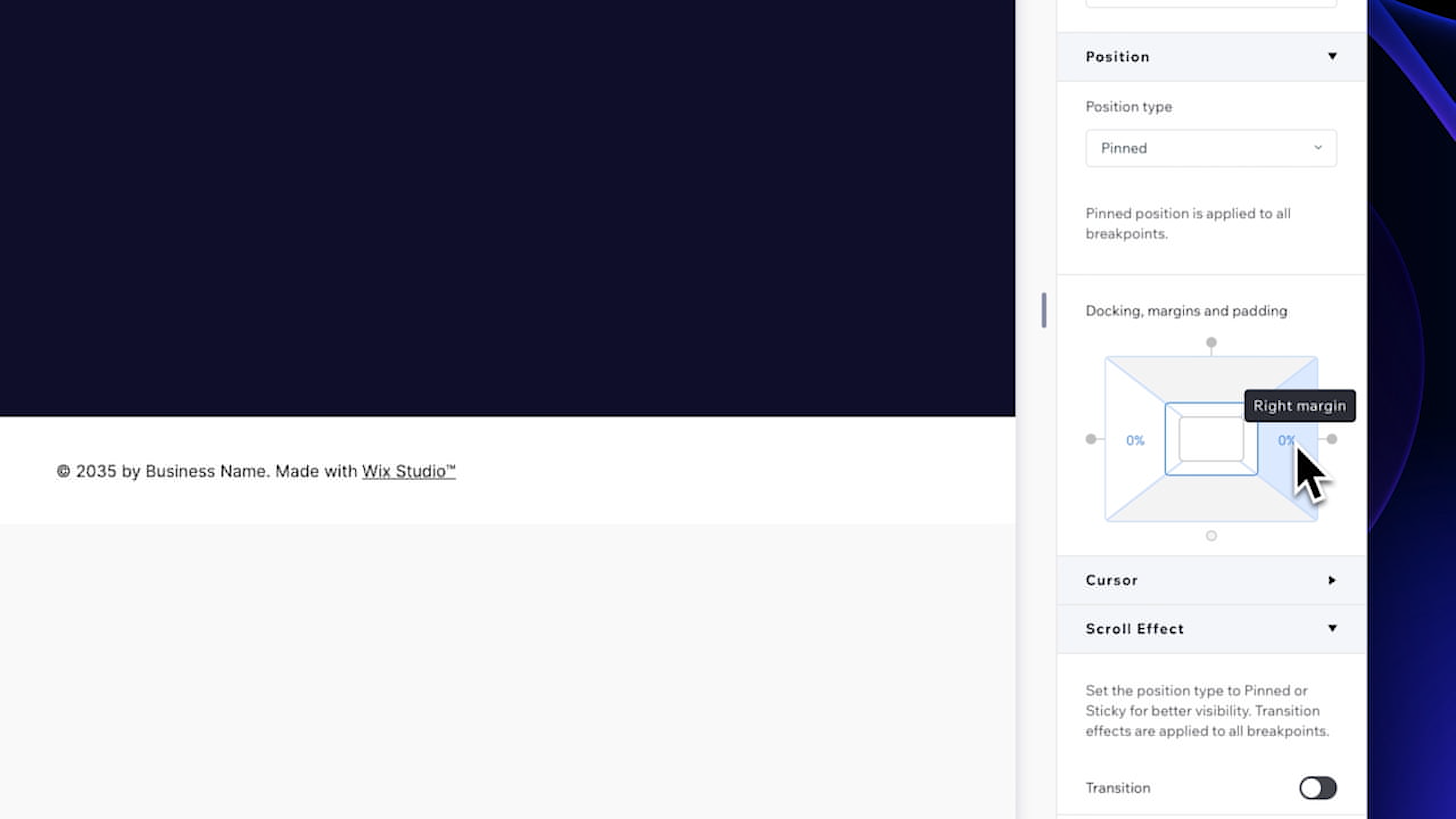
 In our Figma file, we can see that we have a padding of 73 pixels on the left and right. Now back in Wix Studio, select the header section and in the inspector panel go to the position setting. This is where we can adjust docking, margins and padding.
 Docking is a feature that allows elements to be anchored to a specific position within a section or the entire webpage. For example, docking a button to the bottom corner of a screen means it will always appear in that corner, regardless of how the user scrolls or resizes their browser. In our case, we only need to adjust the padding. Set the padding on the left and right to 73 pixels, and convert these values to percentages for better responsiveness on different devices.
 Let's select the Iframe and resize it to match the full width of the header. For the left side of the header where we have a Logo and text, we will use a stack. Stacks allow you to group multiple elements together so that they respond collectively to changes in screen size, maintaining their relative positioning and size.
 To add the logo, return to 'My Uploads' and select the logo from 'Site Files'. Resize it to 44x44 pixels. Next, add a text element on the right side. Set its primary color to white and choose the 'Inter Bold' font. "Finally, adjust the font size to 18 px and edit the text logo. Align it to the center and position it next to the logo. Select your text and the logo while holding the Shift key and create a stack. In the inspector panel, set the item spacing to 4 pixels and make sure to align all elements to the vertical center and align the stack to the left.
 Now on the right side of the header, we'll add a button using Wix Studio's intuitive drag-and-drop feature. Edit the text to “Contact”. Set the button's size to 86x32 pixels and remove the background color. change the font to 'paragraph 1' and change the text color to white. Add a border with a Sky Blue color(#1986CC) and a width of 1 pixel. Center it vertically and align this to the right.
 Let’s now customize the hover state of the button. Set the background color to white with a 20% opacity. This will create a lighter effect over the dark background, ensuring visibility. The text color should be white, complementing the lightly opaque background. Also, set the border color to white but with a 10% opacity, creating a subtle border effect.
 We will now save it as an asset for future use. Simply right-click and select “Save as assets.” Then choose a name for your asset and select the library where you want to store it. Our button is now done and we can preview it to see the hover effect come to life.
 For the menu, drag and drop a menu element from the horizontal menu options. For the menu items, we will need to add more pages to the site. To do so, go to the Pages panel in the left menu and click on the Plus icon. The first page will be About Us, then create another page named Products and finally the last one called News.
 Now go back into the Home page and select the menu. To add these items to the menu, head over to 'Manage Menu', then 'Add Item', selecting 'Main Pages' and 'All Pages'. Now click on the Layout icon and set the spacing between items to 10 pixels .
 In the Inspector Panel, set the background color to black with 18% opacity, and we will also add a white border with a 10% opacity. Now we need to add a corner of 40 pixels and remove the shadow. Now that the menu container is done, we can edit the items by choosing “Menu Items” in the dropdown menu. Set the text color of the items to white with 70% opacity.
 For the hover effect, choose a white background with 20% opacity and set the text color to white. Then add corners of 15 pixels for a modern look. In the Current page state, the text color will be white and reduce the opacity of the menu item’s container to 0%. Finally, set the width of your horizontal menu to 360 pixels. And there you have it! The header section is now beautifully set up, complete with a navigation menu, a customized button, and a sleek, professional look.
 Before we dive into designing our hero section, it's essential to understand the layouts in Wix Studio. In every section, you'll have the option to select from preset layouts, including columns, rows, cards, 3-cell collage, and 4-cell collage. It's important to note that your layout remains customizable even after you've made your selection. The sizes of the cells can be adjusted by dragging their handles.
 To change the layout of an existing section, you can go in the inspector panel and choose a different configuration from the layout menu. This menu also offers features to add cells, proportionally resize your cells either vertically or horizontally and create gaps between cells. Use the CSS grid if you want precise control of the grid but it is a permanent action that turns cells into containers. Lastly, the "Overflow Content" setting is crucial for managing content that is too large for its container. You can choose to show and let the content overflow out of the container, clip the content or allow scrolling within the container.
 Let's get started with our hero section by choosing a column layout. For our design, we'll be setting the section height to 816 pixels. On the left side of our hero section, we'll begin by adding a title, paragraph text, and buttons at the bottom. Starting with the title, select 'heading 1' for your font and change the text color to white for standout contrast. Copy and paste the text from Figma and resize the title to fit our design.
 Next, let's add a paragraph right below the title. Here's another way to add elements: you can right-click, go to 'Quick Add,' and choose 'paragraph.' Once added, ensure it’s set to 'paragraph 2' in the inspector panel and set it to our grey secondary color. As with the title, copy and paste the content. Then, adjust the text size to align with the width of the title. Once resized, position it right below the title.
 Now, it's time to incorporate the buttons. Starting with the left one, locate the button we've previously saved in our assets. Drag and drop this button asset right under our paragraph. Edit the text on the button to say "Learn More". Set the button’s dimensions to 134 x 42 pixels. Let’s change the color to a deep navy blue (#152A51).
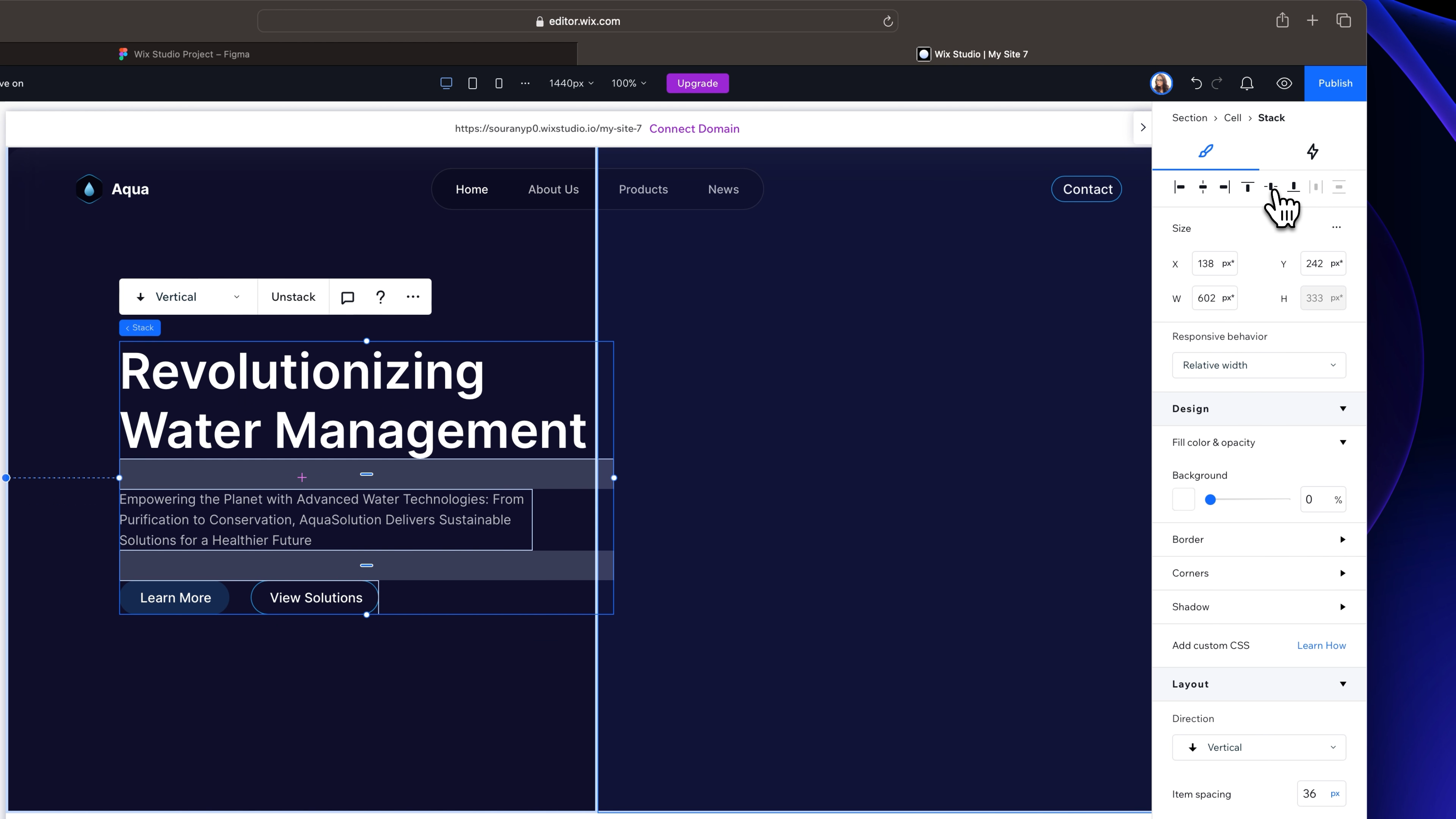
 To add a custom color, simply click on the plus icon here and paste in your color code. Then, click 'add' to apply it and adjust the opacity to 100%. Next, remove the border by setting the width to 0 pixel or you can also remove the opacity. For the second button, we'll use our asset again. After placing it, edit the text accordingly and adjust the size this time to 156 x 42 pixels. Now, create a horizontal stack with these two buttons, with a gap of 26 pixels between them. Use the feature in the layout section to align and center the items.
 Select the buttons stack and hold shift to also select the paragraph and title. Create a vertical stack and set the spacing between items to 36 pixels and align them to the left. Using the technique we covered earlier in the header section, set the margin to 138 pixels on the left and convert this value to a percentage. Align the text content to the horizontal center, and it will be properly aligned within the left cell.
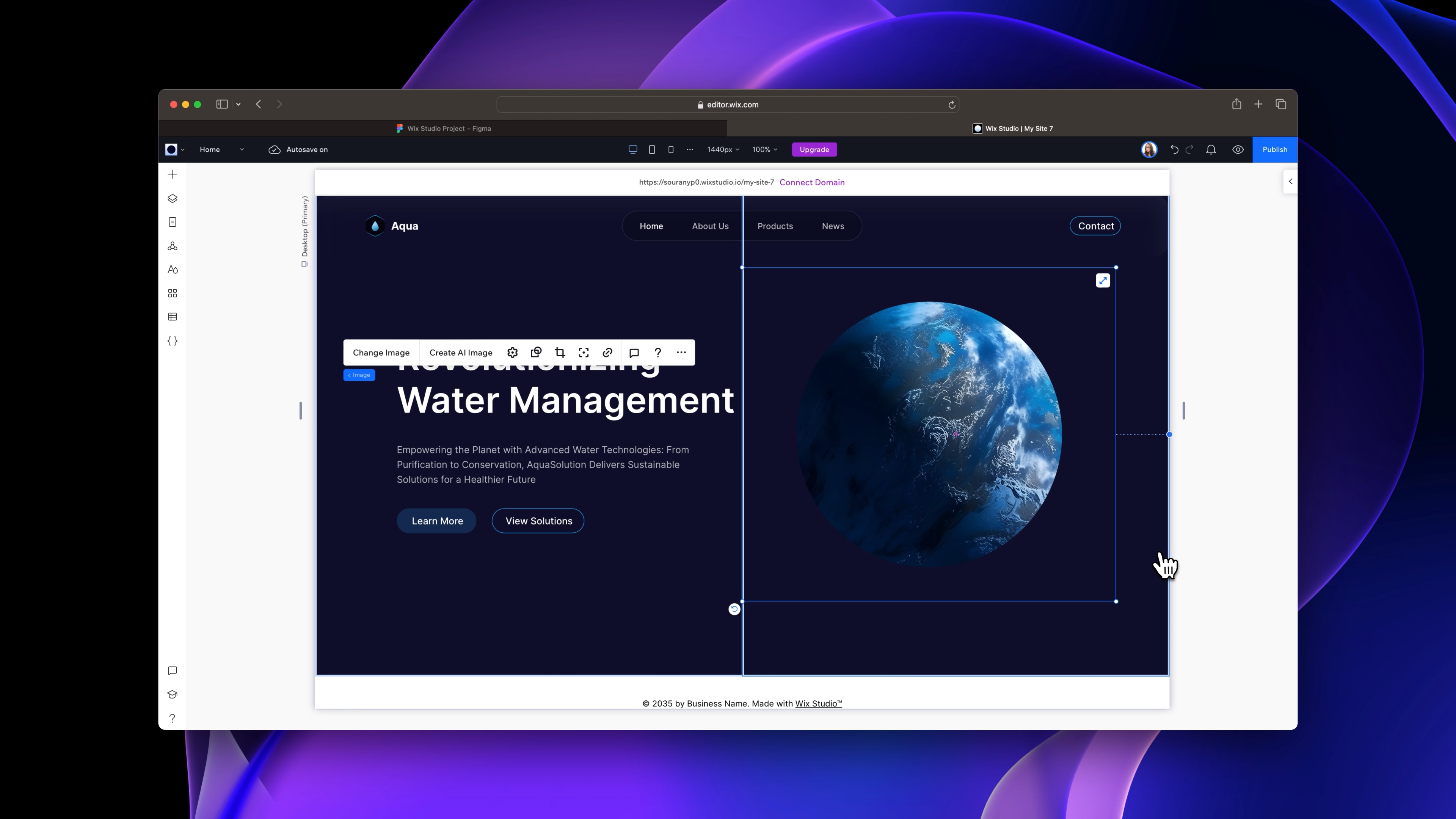
 For the image on the right side, select the cell and add the 'earth' image from our assets. Center it vertically for a balanced look and add a margin of 104 pixels to ensure it's positioned perfectly within the design. Our hero section is all done and looking great, so let's move on to the next step!

Templates and source code
Download source files
Download the videos and assets to refer and learn offline without interuption.
Design template
Source code for all sections
Video files, ePub and subtitles
Videos
Assets
1
Introduction to Wix Studio
Discovering Wix Studio: A Beginner's Guide
5:19
2
Wix Studio Editor
Getting to Know Wix Studio Editor
5:32
3
Layouts
Designing with Precision: Exploring Layouts in Wix Studio
10:15
4
Responsiveness
Responsive Web Building in Wix Studio
16:02
5
Animations and Interactions
Bringing Your Website to Life: Mastering Animation and Interaction in Wix Studio
11:39
Meet the instructor
We all try to be consistent with our way of teaching step-by-step, providing source files and prioritizing design in our courses.
Sourany Phomhome
UI Designer
Designer at Design+Code.
10 courses - 43 hours

Build an Interactive Site with Wix Studio
Discover Wix Studio: the no-code platform ideal for agencies and enterprises. This beginner-friendly video course guides you through web design basics, using intuitive tools for building responsive, professional websites. Learn to create animations easily—no coding required. Gain the skills to craft your own standout sites confidently.
1 hrs

3D UI Interactive Web Design with Spline
Learn to create 3D designs and UI interactions such as 3D icons, UI animations, components, variables, screen resize, scrolling interactions, as well as exporting, optimizing, and publishing your 3D assets on websites
3 hrs

Design and Prototype for iOS 17 in Figma
Crafting engaging experiences for iOS 17 and visionOS using the Figma design tool. Learn about Figma's new prototyping features, Dev Mode, variables and auto layout.
6 hrs

Design and Prototype Apps with Midjourney
A comprehensive course on transforming Midjourney concepts into interactive prototypes using essential design techniques and AI tools
8 hrs

Learn Figma Prototyping
Master interaction design with Figma Prototyping. Create an animated app experience using after delay, scrolling content, video prototype
1 hrs

UI Design for iOS 16 in Sketch
A complete guide to designing for iOS 16 with videos, examples and design files
3 hrs

Prototyping in Figma
Learn the basics of prototyping in Figma by creating interactive flows from custom designs
1 hrs

UI Design Android Apps in Figma
Design Android application UIs from scratch using various tricks and techniques in Figma
2 hrs

UI Design Quick Apps in Figma
Design application UIs from scratch using various tricks and techniques in Figma
12 hrs

Figma Handbook
A comprehensive guide to the best tips and tricks in Figma. Not affiliated with or endorsed by Figma, Inc.
6 hrs
