Button Components
Add to favorites
Simplify Your Design Workflow with Spline Components for Reusable and Dynamic Object Creation
Play video
3D UI Interactive Web Design with Spline
1
Introduction to Spline
10:24
2
3D Shapes and Materials
9:45
3
Weather Icon and Sculpting
13:29
4
Icon Animation
9:27
5
Path Animation
9:35
6
Waves Animation
15:33
7
3D Card with Parallax
9:57
8
Button Components
11:41
9
Screen Resize Adaptive Layout
10:43
10
Tab Bar Animation
21:23
11
UI Charts and Variables
16:54
12
Scroll Interaction and Scenes
9:18
13
Export to USDZ and Optimizations
9:28
14
Publish to 3D Site
3:48

Component
Components are objects that can be reused multiple times throughout your scene. When you change the main component, all the copies automatically change, too. Components help you stay organized and maintain consistency by enabling you to create a design system that can be reused throughout your scene.
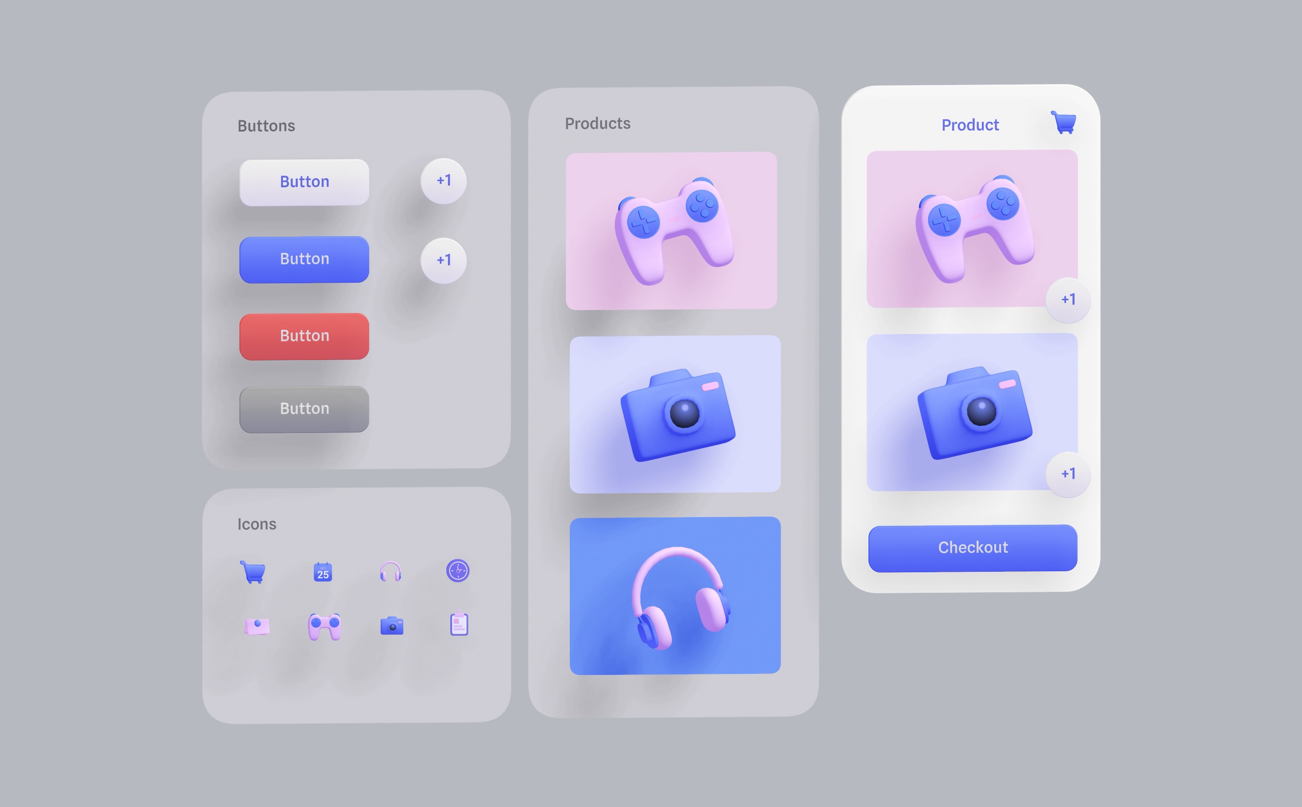
Creating a Component
To create a component, right-click and select 'Create Component' from the object context menu or use the shortcut ⇧⌘K. You'll notice a new symbol in the layer list.

Main Component and Instances
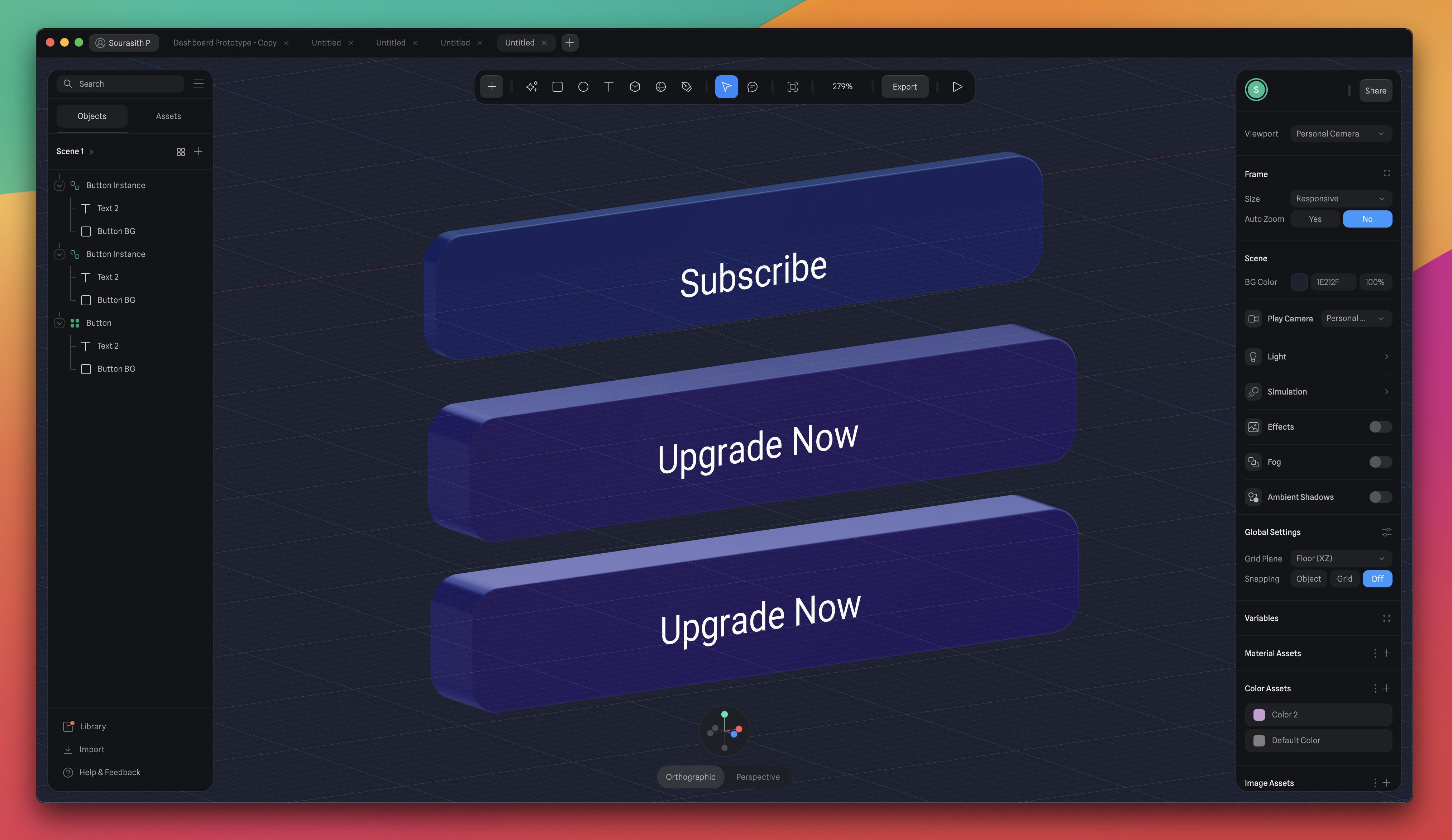
When you create a component, there is the main component and the instance. The main component is the central object that all instances will refer back to and where you can make changes to update all instances. Instances are objects that follow the main component's properties. Changes to the main component affect the instances unless some properties have been modified separately.
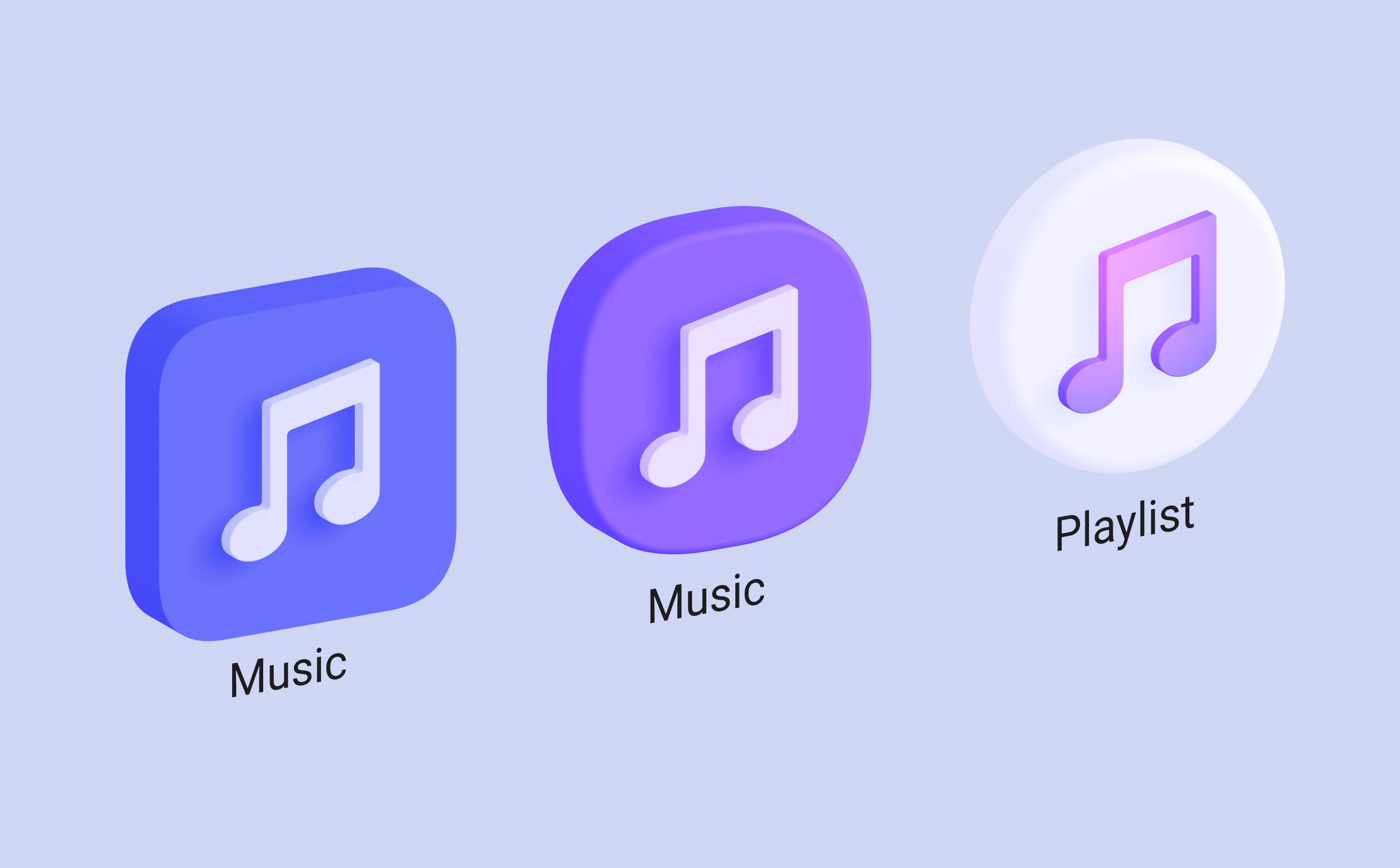
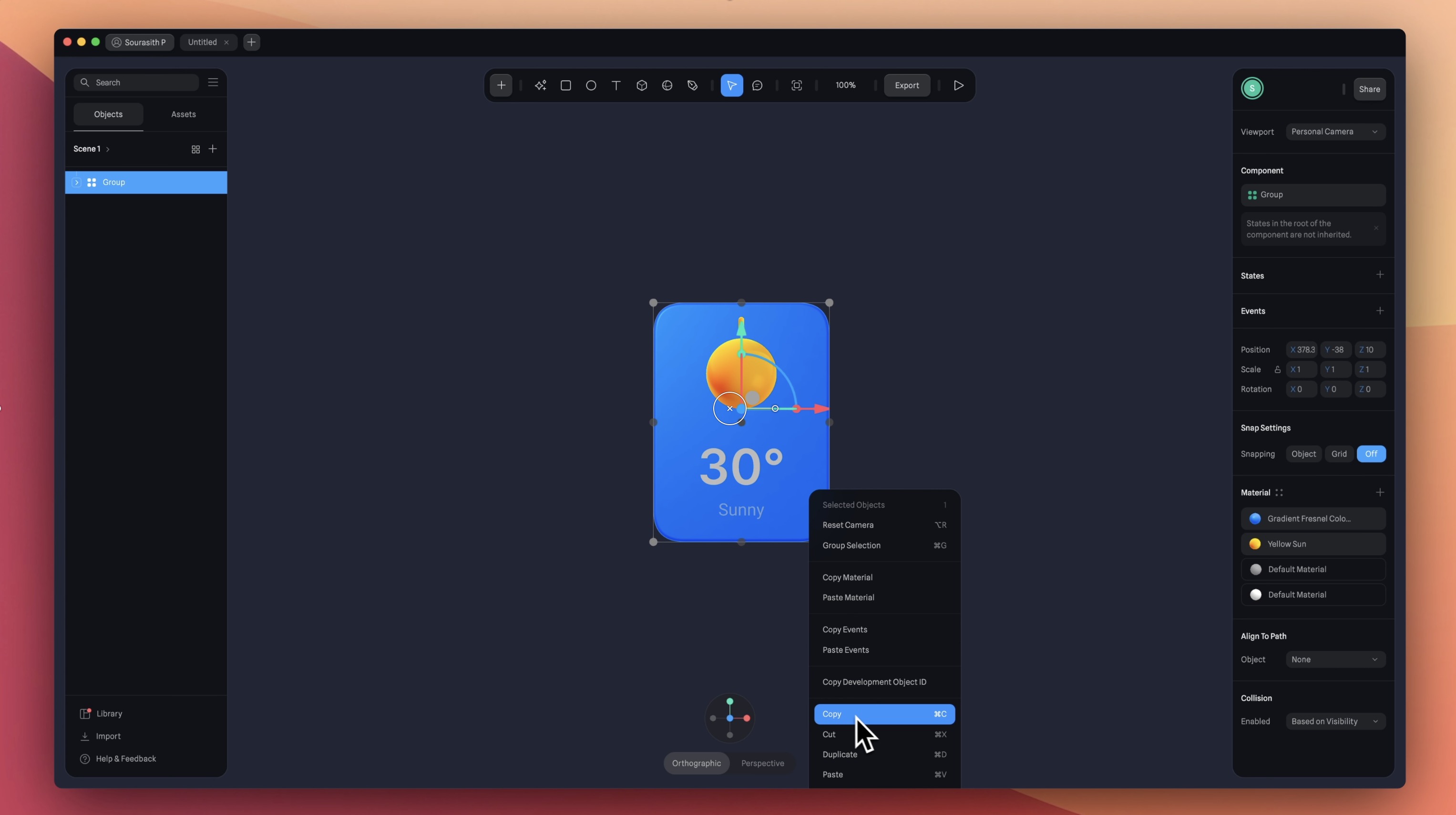
Creating Instances
You can create an instance of the main component in multiple ways: by duplicating it with ⌘D, copying and pasting with ⌘C and ⌘V, or simply dragging it with ⌘ to a different location.
Instance Overrides
Components provide flexibility. You can modify individual instances without affecting the main component. Within an instance, you can customize properties like color, roundness, and more, while keeping the main component's size and other features. This lets you create various unique instances based on the same original object.
Detaching Instances
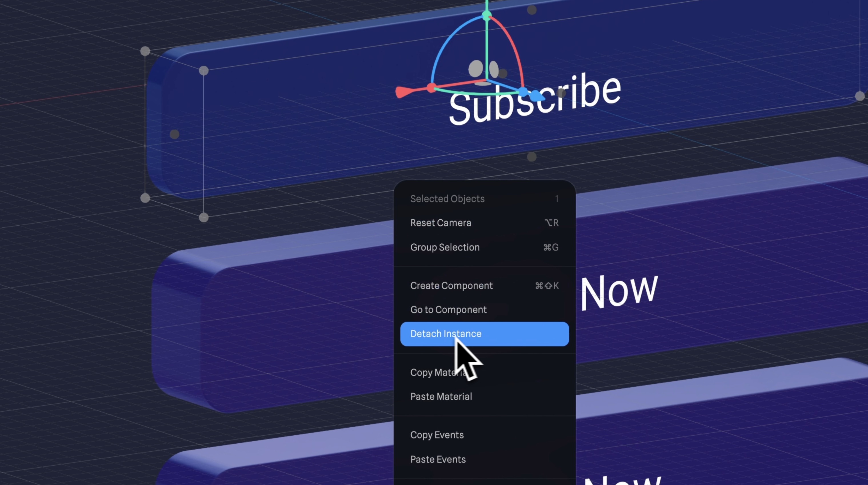
You can detach an instance, which means it's no longer connected to the main component, and any changes to the main component won't affect the detached instance. To do this, select the instance, right-click, and choose "Detach Instance" from the menu, or use the detach icon in the Instance Panel.
Resetting Instance Changes
You can reset any changes you've made to an instance. This can be done from the Instance Panel. You can reset everything or just specific properties to match the main component again.

Component Swapping
In the Instance Panel, you can swap instances with different components. This is useful for experimenting with different designs or variations.

Component Library
We've covered the basics and can now talk about the 3D card. If you want to learn more, check out their official video on Components. You can also explore the component library in Spline, which is interesting.

Opening a File
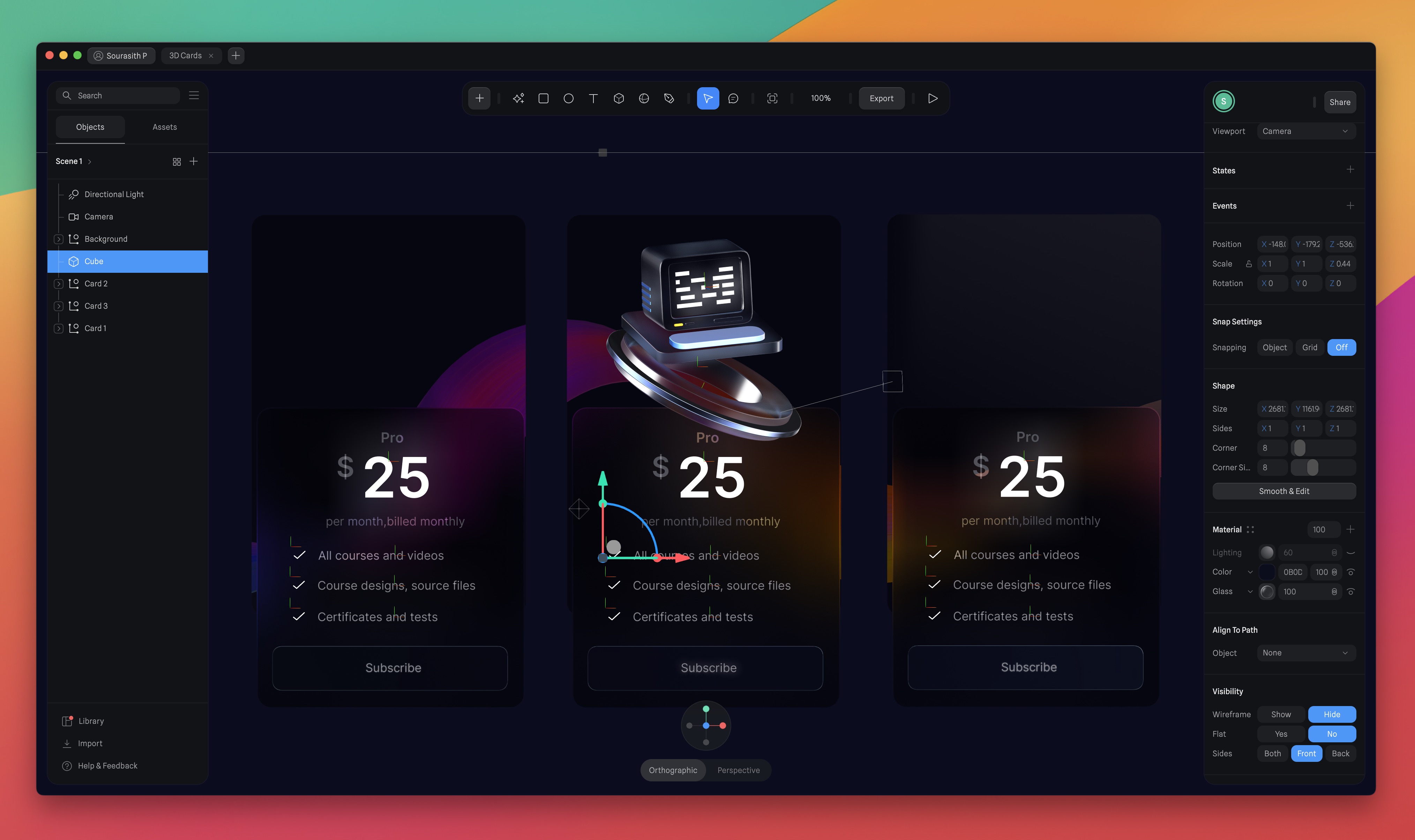
Let's continue from where we left off. Open the 3D card file we used in the last section in Spline. We'll start by finalizing the card by adding text and icon, then we'll move on to the component part.
Creating Text
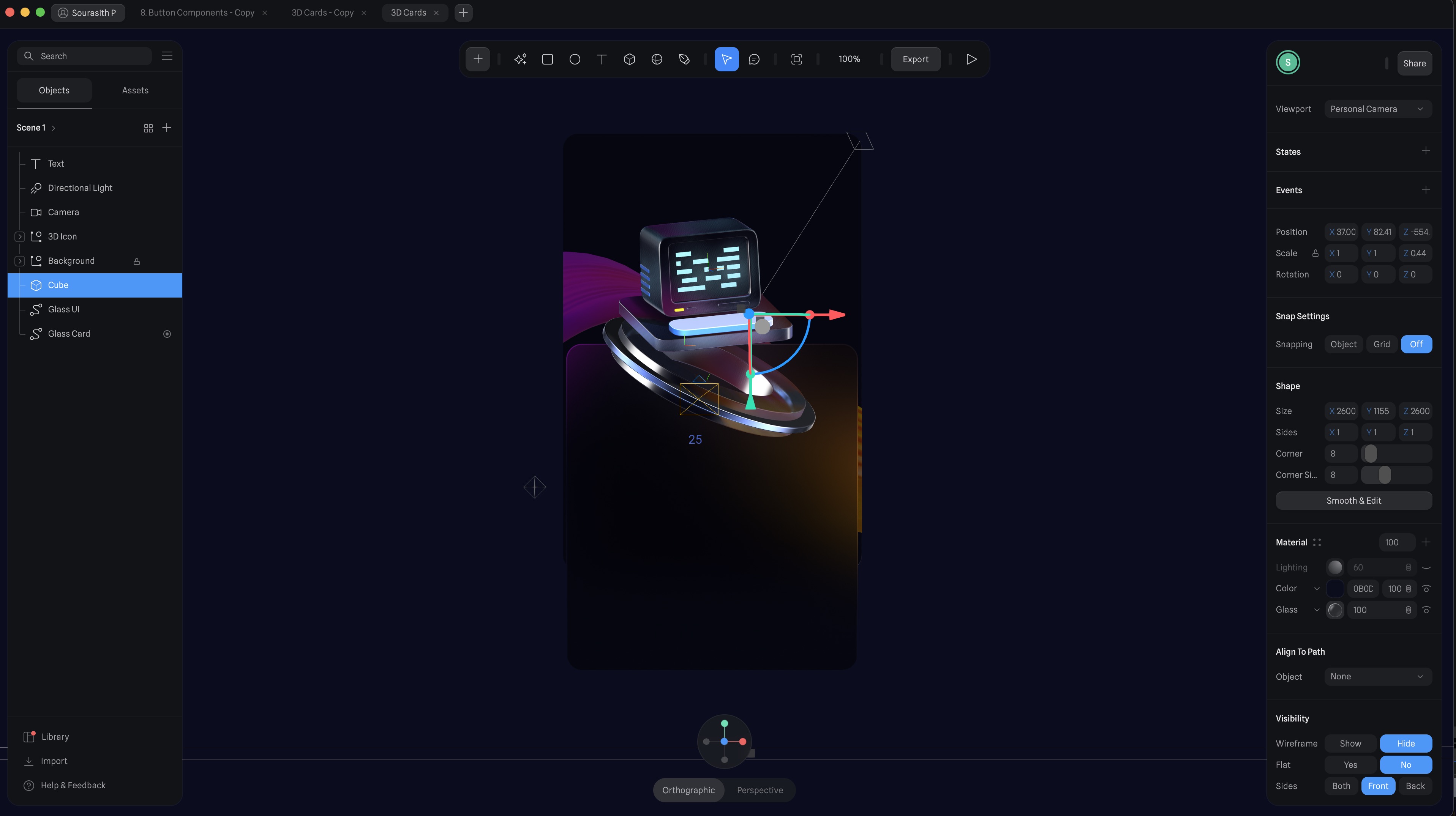
Let's begin by adding text, and you can effortlessly modify it using the Text Panel, where you'll find options to customize elements like font size, font style, and visual effects such as extrusion, bevel, and bevel sides to achieve your desired appearance.
- To create text, click on the text tool icon in the toolbar, and then drag it onto the card.
![Button Components image 12]()
Customize the Text
We create a pricing card so we need information such as price, plan, and period. We'll use the 'Inter' font, which is a Google font, and varying font sizes.
- Price: Write '25' or any other amount, and adjust the size to 260 by 50. Set the font size to 80, and select the 'SemiBold' weight. Apply the color white.
- Currency Symbol: Write '$' and adjust the size to 260 by 30. Set the font size to 40, and select the 'Semibold weight. Apply the color white and reduce the opacity to 30%.
- Plan: Duplicate the currency symbol, change the content to "Pro," and also change the font size to 20.
- Period: Duplicate, change the text to "per month, billed monthly" with a size of 17 and regular weight.

Position
We will move the 3D icon upward because we need space for the information, including the button. Position the 3D icon at X-12, Y-95, and Z-1316. Then, select all the text elements, move them upward, and name the layers.

Import the SVG Icon
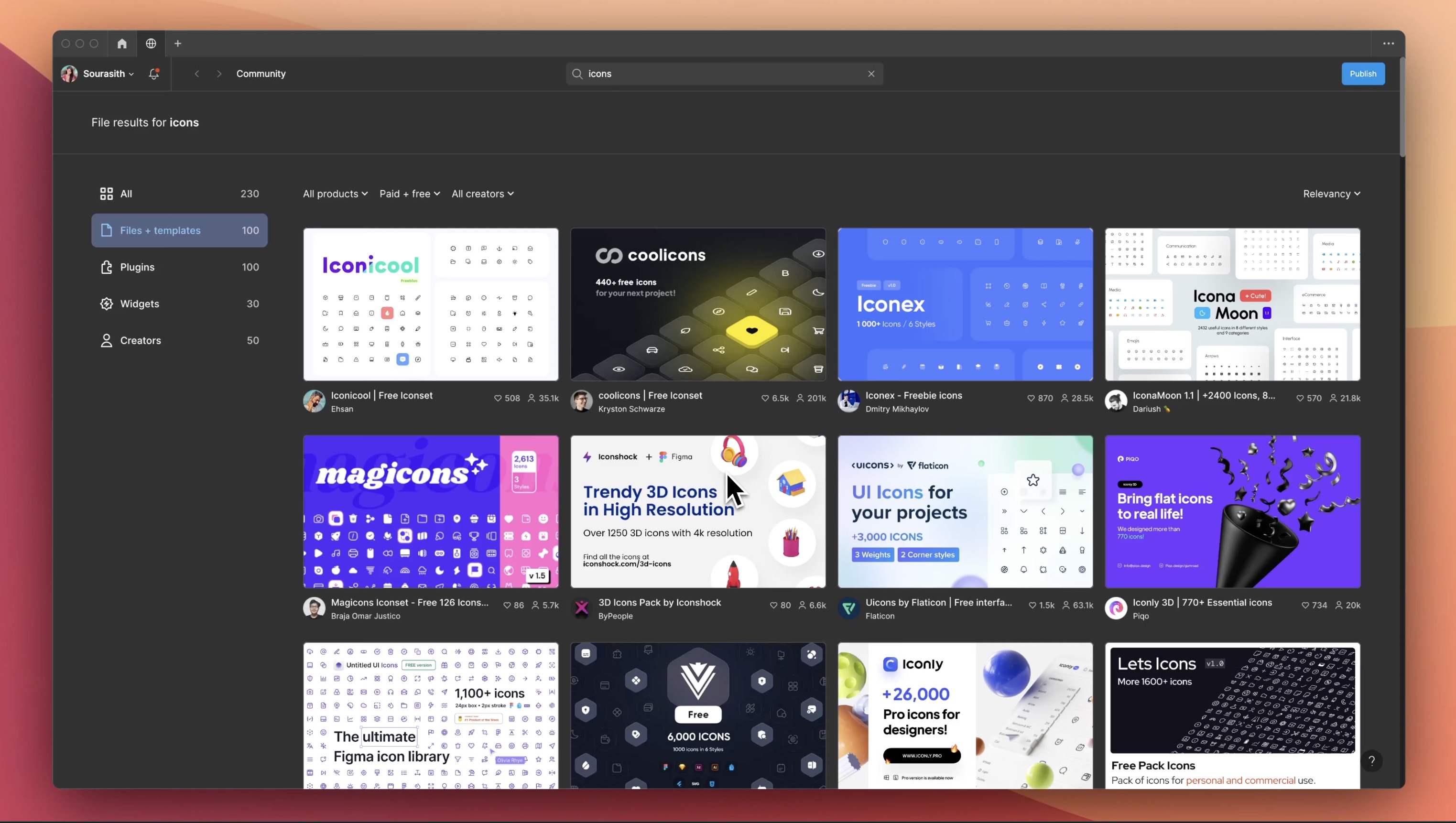
Now, we need an icon - specifically, a checkmark. You can find free icons online or in Figma and import an SVG icon. Once you've selected the icon you want, go to the 'export' option, choose SVG, and click 'Export.' Save it to your desired location, such as the desktop.
Adding Icons
Once you have your icon, drag and drop it onto the scene. Position the icon on the card and add the accompanying text next to it, then create a component. We created a component for this feature because, if, for example, I need to change the icon, the change will automatically apply to all the other icons. This way, I won't have to manually update each one individually.
- Duplicate the text layer, change the content to "All courses and videos." Adjust the size to 310 by 30, font size to 17, line height to 1.20, font style to regular, align it to the center, and apply a white color with 50% opacity.
- Select both the icon and text, then right-click and choose "Create Component."
- Create two instances and change the text to "Course designs, source files" and "Certificates and tests."
![Button Components image 16]()
Creating the Button Component
To complete our 3D card, we need a button. We'll start with a rectangular shaper, apply extrusion and several material such as matcap, fresnel and glass. Then, add text to the button to label it. You can also add animations to the button if desired.
- Create the base using the rectangle, change the dimension to 338 by 64. Set the corner to 16 and extrusion at 12, bevel 1 and bevel sides 1.
![Button Components image 17]()
Apply Material
We're going to apply several materials such as matcap, fresnel and glass, and it's important to follow the order.
- Matcap: Choose a darker reflection, and choose the blending mode, Screen.
- Fresnel: Reduce the opacity to 60, and choose Overlay.
- Matcap: Choose a lighter reflection, select the multiply blending mode, and reduce the opacity to 69.
- Glass: Simply add glass, and Leave the setup as it is.
- Lighting: Leave the setup as it is.
- Add “Subscribe”, set the font size to 17, and align it centrally in both directions. And, of course, the font should still be 'Inter’.
![Button Components image 18]()
Managing Components
Remember that the background card serves as the portal, just like the main card. Duplicate the entire card to create the third card, ensuring consistent spacing as per your design. Customize the text for each card instance to make them unique. To make changes to components, such as the button, navigate to the main component. Changes to the main component affect all instances.
- Duplicate two cards, and remove the 3D icon.
- Select the Glass Card in the two instances, reduce the height to 370.
- I may easily modify the instances without affecting the main component. Let's change the text label to "Create account.”
![Button Components image 19]()
Conclusion
In summary, components in Spline are versatile tools applicable in different situations, including 3D scene creation, design systems, and icon design. They promote efficiency, consistency, and creative exploration in your 3D projects.
Templates and source code
Download source files
Download the videos and assets to refer and learn offline without interuption.
Design template
Source code for all sections
Video files, ePub and subtitles
Assets
1
Introduction to Spline
Learn 3D design, UI animations, icons, components, variables, screen resizing, scrolling, and optimize and publish 3D assets online
10:24
2
3D Shapes and Materials
Creating a 3D Icon in Spline: a step-by-step guide
9:45
3
Weather Icon and Sculpting
Master the art of 3D design with Spline's user-friendly interface, and learn how to create a stunning weather icon in a few easy steps.
13:29
4
Icon Animation
Learn to build a 3D animated weather icon using Spline's intuitive interface and powerful features
9:27
5
Path Animation
Learn how to create 3D paths with the path tool and to edit them
9:35
6
Waves Animation
Mastering Wave Animation with the Spline 3D Tool
15:33
7
3D Card with Parallax
Creating a 3D Card with Parallax Effect using a glass layer
9:57
8
Button Components
Simplify Your Design Workflow with Spline Components for Reusable and Dynamic Object Creation
11:41
9
Screen Resize Adaptive Layout
Creating adaptive layouts with Screen Resize Events using Breakpoints and Transitions
10:43
10
Tab Bar Animation
Crafting Futuristic UI: Designing a Glass Tab Bar with Crystal Floating Button using Spline
21:23
11
UI Charts and Variables
Exploring Variables Usage in Interactive UI Design
16:54
12
Scroll Interaction and Scenes
Crafting Scroll-Based Interactions and Scenes for Web Design
9:18
13
Export to USDZ and Optimizations
Creating immersive AR experiences on iOS devices using Spline's 3D models
9:28
14
Publish to 3D Site
Easily embed your 3D creations on web pages using Spline's native HTML component, the Spline Viewer
3:48
Meet the instructor
We all try to be consistent with our way of teaching step-by-step, providing source files and prioritizing design in our courses.
Akson Phomhome
UI Designer
Designer at Design+Code.
13 courses - 60 hours

AI Design with Ideogram
Meet Ideogram, an AI-powered image generation tool that takes your ideas and transforms them into stunning visuals. Whether you're a designer, marketer, or just a visual enthusiast, Ideogram simplifies the creative process. In this guide, we’ll walk you through step-by-step instructions to create beautiful logos, social media posts, and more.
1 hrs

Build a SwiftUI app with Claude AI
This comprehensive SwiftUI course combines cutting-edge AI assistance with hands-on development, guiding you through the process of transforming Figma designs into fully functional iOS applications. Leveraging Claude 3.5 Sonnet, you'll learn to efficiently generate and refine SwiftUI code, create reusable components, and implement advanced features like animations and responsive layouts.
9 hrs

Prototype and Code iOS apps in Figma and SwiftUI
Welcome to our course on designing a sleek wallet interface with Figma! You’ll learn to create a visually appealing and functional wallet interface using DesignCode and Apple UI Kits. Master prototyping, swipe gestures, carousel animations, overlays, and reusable components. Plus, explore a Figma plugin to easily transition from design to SwiftUI. By the end, you’ll create dynamic, user-friendly prototypes.
3 hrs

Create 3D UI for iOS and visionOS in Spline
Comprehensive 3D Design Course: From Basics to Advanced Techniques for iOS and visionOS using SwiftUI
3 hrs

3D UI Interactive Web Design with Spline
Learn to create 3D designs and UI interactions such as 3D icons, UI animations, components, variables, screen resize, scrolling interactions, as well as exporting, optimizing, and publishing your 3D assets on websites
3 hrs

Design and Prototype for iOS 17 in Figma
Crafting engaging experiences for iOS 17 and visionOS using the Figma design tool. Learn about Figma's new prototyping features, Dev Mode, variables and auto layout.
6 hrs

Design and Prototype Apps with Midjourney
A comprehensive course on transforming Midjourney concepts into interactive prototypes using essential design techniques and AI tools
8 hrs

Web App Design using Midjourney and Figma
Get UI inspirations from Midjourney and learn UI design, colors, typography as a beginner in Figma
2 hrs

UI Design for iOS 16 in Sketch
A complete guide to designing for iOS 16 with videos, examples and design files
3 hrs

UI Design Android Apps in Figma
Design Android application UIs from scratch using various tricks and techniques in Figma
2 hrs

UI Design Smart Home App in Figma
Design a Smart Home app from scratch using various tricks and techniques in Figma
2 hrs

UI Design Quick Apps in Figma
Design application UIs from scratch using various tricks and techniques in Figma
12 hrs

Figma Handbook
A comprehensive guide to the best tips and tricks in Figma. Not affiliated with or endorsed by Figma, Inc.
6 hrs


